Wooden structures add charm and functionality to any garden, from trellises and pergolas to sheds and fencing. However, these structures can be susceptible to the harsh conditions of winter. Proper maintenance before the cold season sets in is essential to ensure longevity and preserve the beauty of your wooden garden elements.
With the arrival of winter, it’s crucial to take preemptive measures to protect the wooden structures in your garden. Harsh weather conditions, such as snow, ice, and freezing temperatures, can cause significant damage if proper care is not taken. Moreover, insects and animals can pose additional threats. In this blog, we’ll cover everything you need to know to keep your wooden garden structures in top condition through the winter months.
The first step in maintaining your wooden structures is a thorough inspection. Check for any signs of wear and tear, such as cracks, splits, or rot. Pay special attention to joints and areas where wood meets the ground, as these spots are more prone to damage.
Before applying any protective treatments, it’s essential to clean your wooden structures. Remove debris, moss, and mildew using a mild detergent and a brush. Power washing can be effective, but ensure you use a low setting to avoid damaging the wood. Once cleaned, allow the wood to dry completely.
Moisture is the number one enemy of wooden structures. Applying a high-quality water-repellent sealer or stain can significantly increase the lifespan of your wooden elements. These products penetrate the wood, creating a barrier against water and preventing swelling, warping, and cracking. Repeat this process every couple of years to maintain the protective layer.
For structures like sheds or greenhouses, insulating can be beneficial. Use breathable covers designed for outdoor use to shield wooden structures from snow and ice. Ensure the covers are secure but allow for some ventilation to prevent mold and mildew buildup.
Preventing Insect and Animal Damage
Insects and animals can wreak havoc on wooden structures, especially during the winter when they seek shelter and food. Treating the wood with insecticides or natural repellents can help deter pests. For larger animals, consider using physical barriers or repellents. Regularly inspect the wood for any signs of insect activity or animal damage.
Even during winter, it’s essential to keep an eye on your wooden structures. Periodically check for any signs of damage or moisture buildup. Address any minor issues promptly to prevent them from becoming significant problems. Clear snow and ice from horizontal surfaces, such as decks and railings, to reduce the risk of weight damage.
Conclusion
Maintaining wooden structures in your garden before winter requires a bit of effort, but the results are well worth it. By taking the time to inspect, clean, protect, and maintain your wooden elements, you can ensure they remain beautiful and functional for years to come. Start your maintenance routine early and be consistent with your efforts to keep winter’s harsh effects at bay.
Seeking professional help is another crucial step in safeguarding your wooden garden structures. Professionals have the expertise and tools to identify potential issues that you might miss and can recommend the best products and practices tailored to your specific needs. Additionally, professional services can save you time and effort, allowing you to enjoy your garden without the stress of winter preparation.
By following these steps, you’ll be well-prepared to face winter and keep your garden looking its best. Have any other tips or personal experiences with maintaining wooden garden structures? I’d love to hear them!
https://hellopainting.ca/wp-content/uploads/2024/11/Outerview_of_the_garden_0.jpg7681368hellopaintinghttps://hellopainting.ca/wp-content/uploads/2024/05/hello-painting-logo-300x300.pnghellopainting2024-11-05 13:19:352024-11-05 13:21:31Maintaining Wooden Structures in Your Garden Before Winter
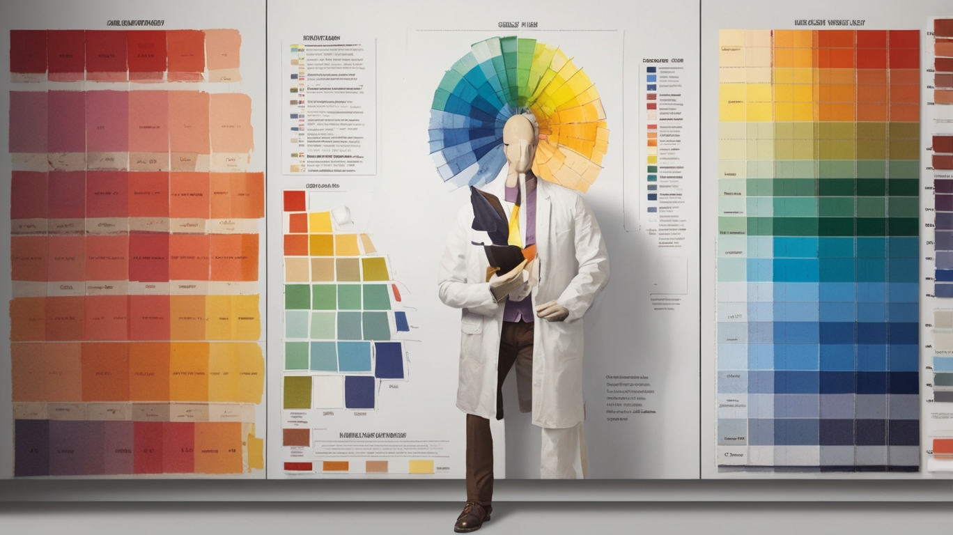
Color choices in commercial spaces directly influence customer behavior, employee productivity, and brand perception. A color psychology chart serves as an essential tool for business owners and designers who want to make informed decisions about their workspace esthetics. Understanding the emotional and psychological impact of different colors helps create environments that support specific business objectives.
This comprehensive guide explains how to effectively use a color psychology chart when painting commercial spaces. We examine the psychological effects of warm, cool, and neutral colors, provide practical tips for matching colors to your brand identity, and outline professional collaboration strategies for optimal workspace design. The information presented will help you make confident color choices that enhance your commercial environment and support your business goals.
Understanding the Basics of Color Psychology
The science of color psychology reveals fascinating insights into how different hues shape human behavior and decision-making. Understanding this relationship is crucial for creating effective commercial environments that resonate with both customers and employees.
What is a color psychology chart?
A color psychology chart is a strategic tool that maps out the emotional and psychological impacts of different colors on human behavior. It serves as a comprehensive guide that breaks down how various hues influence mood, perception, and actions. This scientific framework helps businesses make informed decisions about their interior color schemes based on documented psychological responses rather than mere esthetic preferences.
How colors affect emotions and behavior
Research shows that colors trigger specific emotional and physiological responses in humans. Here’s how different color categories influence our behavior:
Warm Colors (Red, Orange, Yellow)
Increase energy and excitement
Boost appetite and social interaction
Can raise heart rate and blood pressure
Cool Colors (Blue, Green, Purple)
Promote calmness and focus
Enhance creative thinking
Reduce stress and anxiety
Studies indicate that up to 90% of snap judgments about products are based on color alone. While personal experiences and cultural backgrounds can modify these responses, certain color effects remain remarkably consistent across populations. For instance, blue consistently ranks as the most trusted color globally, while green has been proven to enhance creative thinking and productivity.
The importance of color in commercial spaces
In commercial environments, color psychology plays a pivotal role in shaping business outcomes. The right color choices can:
Enhance brand recognition: Strategic color use can boost brand awareness by up to 80%
Influence purchasing decisions: Colors can affect up to 85% of customers’ buying choices
Create desired atmospheres: Different hues can establish specific moods, from energetic to calming
Understanding color psychology is particularly crucial in commercial spaces because it affects both conscious and unconscious behaviors. For example, research shows that red can increase heart rate and create urgency, making it effective for clearance sales but potentially problematic in areas requiring focused work or relaxation.
The impact of color extends beyond immediate emotional responses. In retail environments, customers make judgments about a space within 90 seconds of entering, with 62-90% of that assessment based solely on color. This demonstrates why thoughtful color selection is not just about esthetics—it’s a fundamental aspect of business strategy and space optimization.
Analyzing Different Colors and Their Effects
Understanding how different colors influence human behavior is crucial for creating effective commercial spaces. Let’s explore the psychological impact of various color categories and their practical applications in business environments.
Warm colors: Red, Orange, Yellow
Warm colors create dynamic, energetic environments that can significantly impact both customers and employees. Red stimulates excitement and increases heart rate, making it ideal for retail spaces seeking quick customer turnover. However, its intensity requires careful application—too much can cause anxiety and stress.
Orange combines red’s energy with yellow’s optimism, creating a welcoming atmosphere that encourages social interaction and creativity. It’s particularly effective in collaborative spaces and casual dining areas. Yellow boosts optimism and creativity, making it excellent for training rooms and innovation spaces. However, bright yellows should be used sparingly as they can cause eye strain and frustration.
Cool colors: Blue, Green, Purple
Cool colors promote focus and tranquility, making them valuable for various commercial settings. Blue stands out as the most productive color for detail-oriented tasks. It reduces mental strain and creates an atmosphere of trust and dependability—ideal for financial institutions and corporate offices.
Green offers a perfect balance between efficiency and wellbeing. It causes less eye fatigue than other colors, making it suitable for spaces where employees work extended hours. Purple, with its associations of luxury and creativity, works well in high-end retail environments and creative agencies.
Color Temperature
Best Commercial Applications
Psychological Effects
Warm Colors
Retail, Restaurants, Gyms
Energy, Excitement, Urgency
Cool Colors
Offices, Healthcare, Spas
Focus, Calm, Trust
Neutral Colors
Professional Services, Luxury Brands
Balance, Sophistication
Neutral colors: White, Black, Gray
Neutral colors provide essential balance and sophistication in commercial spaces. White creates an impression of cleanliness and purity, making spaces appear larger. However, using too much white can feel sterile and uninspiring. It works best as a foundation color complemented by strategic accent colors.
Black conveys power and elegance, particularly effective in luxury retail and executive spaces. Used sparingly, it can create dramatic contrast and sophistication. Gray offers versatility and professionalism, serving as an excellent backdrop for more vibrant accent colors. It can cool down a space while maintaining a sense of stability and maturity.
Key considerations for commercial applications:
Space Function: Match color intensity to the intended activity level
Duration of Exposure: Consider how long people will spend in the space
Brand Alignment: Ensure colors complement your brand identity
Cultural Context: Account for cultural color associations in your target market
Applying Color Psychology to Commercial Spaces
Successfully implementing a color psychology chart in commercial spaces requires careful planning and strategic execution. Let’s explore how to effectively translate color theory into practical applications that enhance your business environment.
Matching colors to your brand identity
Your brand’s core values should guide your color selection process. Research shows that up to 85% of consumers base purchasing decisions on color, making it crucial to align your space’s color scheme with your brand message. Start by listing your company’s key values and identify colors that represent these characteristics. For example, if trust and reliability are central to your brand, incorporating appropriate shades of blue can reinforce these qualities.
Consider your target demographic’s preferences when selecting colors. Different age groups and cultural backgrounds may respond differently to various color combinations. This understanding helps create spaces that resonate with your specific audience while maintaining brand consistency.
Considering the purpose of each space
Different areas within your commercial space serve distinct functions, requiring tailored color approaches. Here’s how to optimize each area:
Space Type
Recommended Colors
Purpose
Meeting Rooms
Cool blues/greens
Focus and calm
Creative Areas
Yellow accents
Energy and innovation
Customer Areas
Brand colors + neutrals
Recognition and comfort
Work Zones
Balanced combinations
Productivity and wellbeing
Creating balance and contrast
The 60-30-10 rule provides a framework for creating harmonious commercial spaces:
60% Primary color (walls and large surfaces)
30% Secondary color (furniture and textiles)
10% Accent color (accessories and highlights)
Balance warm and cool tones to create dynamic yet comfortable environments. Too many warm colors can feel overwhelming, while an excess of cool tones might appear uninviting. The key is finding the right mix that supports your space’s intended function while maintaining visual interest.
Testing colors before committing
Before implementing your chosen color scheme, follow these essential testing steps:
Apply test patches in different lighting conditions
Observe colors during various times of day
Gather feedback from employees and customers
Consider seasonal lighting changes
Test colors against existing furniture and fixtures
Remember that natural and artificial lighting can significantly affect how colors appear and influence mood. Monitor these test areas over several days to ensure they maintain their desired effect under different conditions.
When implementing your color scheme, start with smaller areas or accent walls before committing to large-scale changes. This approach allows you to gage real-world reactions and make adjustments based on actual user experience rather than theoretical predictions.
The success of your color implementation depends heavily on professional execution. Consider consulting with color professionals who can provide expertise on practical aspects like paint finish selection and lighting integration. They can help ensure your chosen colors achieve the desired psychological impact while meeting practical requirements for maintenance and longevity.
Regular evaluation of your color scheme’s effectiveness through customer feedback and employee surveys helps maintain an optimal environment. This ongoing assessment allows you to make informed adjustments that keep your space aligned with evolving brand needs and user preferences.
Best Practices for Using a Color Psychology Chart
Implementing effective color strategies in commercial spaces requires more than just selecting appealing hues. To maximize the impact of your color psychology chart, following established best practices ensures successful outcomes while avoiding costly mistakes.
Consulting color professionals
Professional color consultants bring valuable expertise to your commercial space design. Their understanding of color psychology charts goes beyond basic theory, incorporating practical considerations like brand alignment, space functionality, and customer behavior patterns. These experts can:
Conduct comprehensive space evaluations
Create custom color palettes that align with your goals
Provide visualization tools for better decision-making
Ensure proper color placement and balance
Recommend appropriate paint finishes
Working with professionals helps avoid common pitfalls while ensuring your color choices support your business objectives effectively.
Considering lighting and space
Lighting dramatically affects color perception and psychological impact. Understanding the interplay between light and color is crucial for achieving desired results:
Lighting Type
Impact on Color
Considerations
Natural Light
Changes throughout day
Test colors at different times
LED Lighting
Can alter color temperature
Choose appropriate color temperature
Fluorescent
May create color distortion
Account for color rendering index
Accent Lighting
Creates focal points
Use strategically for emphasis
The direction and intensity of light sources also influence mood and atmosphere. Lighting positioned above eye level creates formal environments, while below eye level lighting generates more casual atmospheres.
Updating colors periodically
Color preferences and psychological impacts evolve with changing seasons and trends. Regular updates help maintain your space’s effectiveness and relevance. Consider:
Seasonal color adjustments to match natural cycles
Periodic refreshes to align with current design trends
Updates to reflect evolving brand identity
Modifications based on space usage patterns
Regular maintenance to preserve color integrity
Strategic timing of color updates can coincide with other business improvements, maximizing impact while minimizing disruption. For retail spaces, seasonal color changes can boost customer engagement and create fresh experiences.
Gathering feedback from employees and customers
Continuous feedback helps optimize your color strategy’s effectiveness. Research shows that color can influence up to 85% of purchasing decisions, making customer input particularly valuable. Implement a structured feedback system that includes:
Regular surveys and questionnaires
Observation of traffic patterns
Analysis of dwell time in different areas
Employee productivity assessments
Customer behavior monitoring
Use this feedback to make data-driven adjustments to your color scheme. Pay special attention to areas where customers and employees spend significant time, as these spaces have the most substantial impact on behavior and satisfaction.
Remember that color psychology isn’t static – it’s influenced by cultural factors, individual experiences, and changing preferences. Regular assessment and adjustment of your color strategy ensures your commercial space continues to support your business goals effectively.
Professional color consultation services often include ongoing support for monitoring and updating your color scheme. This partnership helps maintain the psychological effectiveness of your space while adapting to changing needs and preferences over time.
Conclusion
Color psychology serves as a powerful tool for creating purposeful commercial environments that drive business success. Scientific research confirms that strategic color selection influences customer behavior, employee productivity, and brand perception. Understanding these psychological effects enables businesses to make informed decisions about their space design, leading to enhanced customer experiences and improved operational outcomes.
Professional implementation of color psychology principles transforms theoretical knowledge into practical results. Regular evaluation of color schemes, combined with expert guidance and stakeholder feedback, ensures commercial spaces maintain their psychological effectiveness over time. Businesses that embrace this scientific approach to color selection create environments that support their goals while providing meaningful experiences for both customers and employees.
https://hellopainting.ca/wp-content/uploads/2024/11/Color_Psychology_Chart_for_Painting_Commerc_1.jpg7681368hellopaintinghttps://hellopainting.ca/wp-content/uploads/2024/05/hello-painting-logo-300x300.pnghellopainting2024-11-03 09:55:262024-11-05 01:48:16How to Use a Color Psychology Chart for Painting Commercial Spaces
Wall paint colors have been a canvas for human expression for centuries, evolving alongside cultural, technological, and societal shifts. From the ancient Egyptians to the modern day, the colors we choose to adorn our walls reflect our tastes, values, and aspirations.
In Ancient Egypt, The Egyptians favored earthy tones like ochre and terracotta, symbolizing the desert landscape. These colors were often used in conjunction with hieroglyphics and other symbolic motifs.
In Ancient Greece and Rome, White was a popular choice, symbolizing purity and light. However, the wealthy classes often adorned their walls with vibrant frescoes and murals depicting mythological scenes and everyday life.
In Medieval Europe: During the Middle Ages, dark, muted colors like browns and greens were common. The limited availability of pigments and the desire to create a somber, spiritual atmosphere influenced color choices. However, as the Renaissance dawned, a renewed interest in classical art and humanism led to a resurgence of color and light.
In the era of Renaissance, Rich hues of red, blue, and gold became popular, reflecting the opulence and grandeur of the period. These colors were often used in conjunction with intricate decorative motifs and ornate plaster work.
In Baroque period saw a continuation of the Renaissance trend towards rich, saturated colors. However, Baroque interiors often featured more dramatic and theatrical color schemes, with strong contrasts between light and dark.
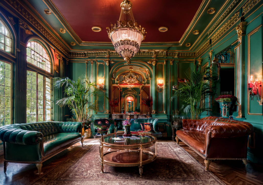
The Victorian era was characterized by a love of ornate decoration and a fascination with the exotic. Dark, moody colors like deep reds, purples, and greens were popular, reflecting the Victorian era’s dramatic and theatrical style.
When it comes to 20th Century, with the industrial development, the variety of colors and paint quality has increased rapidly. Therefore, we can see many relative short termed trends in the last century.
The Art Deco movement of the 1920s and 1930s embraced bold geometric patterns and bright, primary colors.
Mid-century modern design, popular in the 1950s and 1960s, favored clean lines and neutral colors like beige, gray, and white.
The late 20th century saw a resurgence of bold, vibrant colors like orange, yellow, and turquoise, reflecting a sense of optimism and experimentation.
2025 Color Trends
As we move into 2025, we can expect to see a continuation of earthy tones, with a focus on sustainability and natural materials. Here are two key trends:
Earthy Neutrals: Soft, muted tones like clay, terracotta, and sage green will continue to dominate. These colors evoke a sense of calm and connection to nature.
Bold Accents: While neutral palettes will be popular, we’ll also see a resurgence of bold, saturated colors. Think deep blues, vibrant greens, and rich purples. These colors can be used as accent walls or to create a focal point in a room.
Ultimately, the best wall color for your space is one that reflects your personal style and creates an atmosphere that you love. Whether you prefer classic elegance, modern minimalism, or a bold, eclectic look, there’s a color trend out there for you.
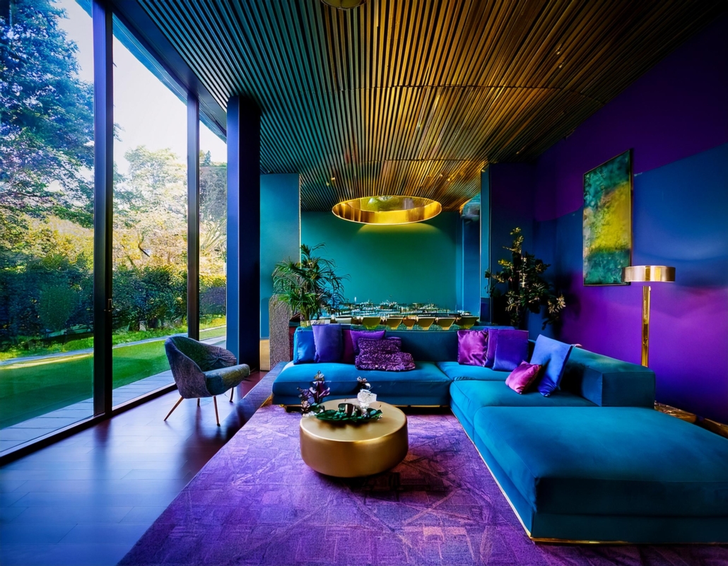
https://hellopainting.ca/wp-content/uploads/2024/10/Inner-view-of-living-room1.jpeg17922304hellopaintinghttps://hellopainting.ca/wp-content/uploads/2024/05/hello-painting-logo-300x300.pnghellopainting2024-10-31 06:42:382024-10-31 07:08:21A Kaleidoscope of Colors: The Fashion of Wall Paint Colors
We may request cookies to be set on your device. We use cookies to let us know when you visit our websites, how you interact with us, to enrich your user experience, and to customize your relationship with our website.
Click on the different category headings to find out more. You can also change some of your preferences. Note that blocking some types of cookies may impact your experience on our websites and the services we are able to offer.
Essential Website Cookies
These cookies are strictly necessary to provide you with services available through our website and to use some of its features.
Because these cookies are strictly necessary to deliver the website, refusing them will have impact how our site functions. You always can block or delete cookies by changing your browser settings and force blocking all cookies on this website. But this will always prompt you to accept/refuse cookies when revisiting our site.
We fully respect if you want to refuse cookies but to avoid asking you again and again kindly allow us to store a cookie for that. You are free to opt out any time or opt in for other cookies to get a better experience. If you refuse cookies we will remove all set cookies in our domain.
We provide you with a list of stored cookies on your computer in our domain so you can check what we stored. Due to security reasons we are not able to show or modify cookies from other domains. You can check these in your browser security settings.
Other external services
We also use different external services like Google Webfonts, Google Maps, and external Video providers. Since these providers may collect personal data like your IP address we allow you to block them here. Please be aware that this might heavily reduce the functionality and appearance of our site. Changes will take effect once you reload the page.
Google Webfont Settings:
Google Map Settings:
Google reCaptcha Settings:
Vimeo and Youtube video embeds:
Privacy Policy
You can read about our cookies and privacy settings in detail on our Privacy Policy Page.